The Leprosy Mission Logo — steeped in historical significance
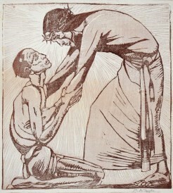
The Leprosy Mission logo goes back to the 1920s or early 30s. It was designed as a woodcut by an English woman artist, Mabel Royd. This woodcut design represented Jesus and the man with leprosy who knelt at Jesus’ feet asking to be healed – and Jesus healed him (see Mark 1:40-42). It deeply expressed the heart’s desire of The Leprosy Mission’s Founder, Wellesley Bailey, who wrote “I felt if ever there was a Christ-like work in this world it was to go among these poor sufferers and bring to them the consolation of the Gospel”.
The origins of this woodcut design go back to the time when Mr Donald Miller was the Mission’s Secretary for India.
Donald Miller’s service to those who suffer from leprosy began in 1922 when he was posted by the Mission to its largest home in Purulia in West Bengal, India. In 1924 he became the Mission’s Secretary for India, organising and developing the work in that country where the Mission began its activities and where it still has its largest field. From 1943 until 1960 he was General Secretary of The Mission to Lepers (later The Leprosy Mission) based in London, UK.
During his time as Secretary for India, Donald Miller was looking for a symbolic drawing for the Indian Auxiliary and drew in an amateurish way the figure of Christ and a kneeling leprosy sufferer.
Shortly after Donald Miller’s marriage, he was invited to luncheon at Ranchi with the District Commissioner, Mr Hubback and his wife (later to become Sir John and Lady Hubback). In their large drawing room were a number of striking coloured woodcuts; all done in the same style and signed by M.A. Royds. Mr Miller spoke appreciatively of them and was told that they were in fact done by Mrs Hubback’s sister – Mrs Lumsden, who still used her maiden name in her work as an artist – M.A. Royds.
“I wonder”, said Mr. Miller, “if she would accept a commission to do one of ‘Christ and the leper’, which I am wanting as an Indian Auxiliary symbol.
Mrs Lumsden accepted the commission and took Mr Miller’s rough draft as the basis of the design, and so the original The Leprosy Mission logo came into being.
Mr Miller’s own original print went down with the ship, City of Cairo, which was torpedoed in the South Atlantic in November 1942 during World War 2, when he was travelling with his wife to London to take up the position of General Secretary of the Mission. Fortunately he had already sent a copy to Bloomsbury Square, the then Headquarters of The Leprosy Mission, and later Portland Place.
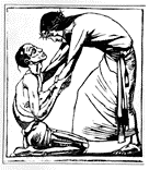
Reproduced as a black and white line drawing, Mabel Royd’s illustration and a couple of similar versions of it were used in different early publications, possibly including “Without the Camp” one of the very earliest Mission newsletters. The Bible verse also was occasionally used with the logo. It was used in promotional materials by The Leprosy Mission and by various National Councils right around the world up until the 1970s to 1980s.
Much later a wood carver in Thailand used the print as the basis of a wooden, carved, wall-hung version of the original woodcut design in light-coloured wood. It was made in Chiang Mai around the 1970s/80s, as well as a fully three- dimensional carving in dark brown ebony – with Christ as an African – commissioned in the 1960s from a group of sculptor/carvers in Southern Tanzania.
A new version of the Logo was introduced by the artist and writer, Eddie Askew in around 1973 when he was The Leprosy Mission’s International Director. It was created around the time that the Good News Bible was produced in the early 1970s, (with its cartoon-like line-drawing illustrations). Eddie’s version resembled the Good News Bible cartoon style. Eddie Askew’s logo version was very contemporary back then (and not a little controversial!) Gradually over the next 13 years this new contemporary version was adopted by The Leprosy Mission supporting countries and implementing countries around the world. Wherever The Leprosy Mission was working, whether in hospitals in India, Bangladesh or Nepal, or clinics, community centres and outpatient services in Africa, or Asia, this logo was displayed and represented hope, healing and restoration for people affected by leprosy.


